Maggi, Nestle India’s single-largest revenue earner, was banned in June 2015 for six months across India on allegations that it contained chemicals beyond prescribed limits.
The company had to recall 38,000 tonnes of Maggi noodles from millions of retail shelves and destroy them. The ban was relaxed in November 2015.
The controversy has been the biggest faced by the listed Indian arm of the world’s biggest packaged foods maker — Nestle, with Maggi losing over Rs 1,000 crore in sales and a serious dent to its brand image.
Maggi had returned to store shelves by November ’15 after multiple clearances from government-certified laboratories, and also returned to the leadership position with re-conquering market share of 60% in 2017. Source.

Rising to market leader position in a short span of time after series of such brand devastating incidents is something that other companies wouldn’t be dared to think about if it ain’t for Maggi.
I never thought we would have a recovery as fast as we had. For a brand that was critically declared dead in June 2015, coming to under 60% of the market share is a big deal. — Nestle India, Chairman & MD, Suresh Narayanan. Source: business today
Though several measures have been taken by the company to bring the brand back to life, to gain back the same level of trust & love is definitely a rare possibility. But Maggi seems to have achieved this. The mystical force behind Maggie to stage a such an epic comeback lies in the secret — how it is branded — the emotional branding principles that were used in the making of this legendary brand. Let us uncover those in detail.
Building Strong Tagline tapping on the problem statements:
A tagline is a three to seven word phrase that accompanies your logo. It expresses your company’s most important benefits and/or what you want your customers to remember about working with you. Think of it as the words you want to linger in your target customers mind about you and what you have to offer.
Early Indian consumer market was unused to fast foods & was very reluctant to welcome a change in their food habits. Nestle had to promote noodles as a concept before it could promote Maggi as a brand. They used strong taglines which tapped on the problem statements to address this.
- 2 mins noodles — Convenience.
- Taste Bhi Health Bhi — Health.
- 2-minute mein Khushiyan (Happiness in 2 minutes) — Fun & Happiness.
It was devised as a two-pronged strategy to attract mothers on the ‘health & convenience’ plank and lure kids on the ‘fun’ plank.

Strong Visual Identity:
When it comes to branding, your visual identity plays a huge part in creating a great impression whether it be the first one or an everlasting one.
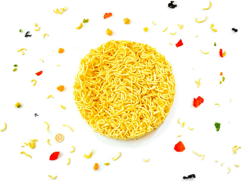
Maggie has been doing this so efficiently that they managed to check all the boxes in visual branding. Be it creative packaging, colour selection, logo consistency — they are spot on.
- Colour selection — red & yellow — bright, attractive — scientifically known to induce hunger in human beings.
- Logo consistency — literally remained unchanged since its origin — with such a consistent logo & colour elements, every age group will be able to relate to the brand over a period of time, evoking nostalgia. Here’s a great piece on — Why Nostalgia Marketing Works So Well With Millennials.
- Packaging — creative & establishing a personal connection — Maggi ran a campaign “Meri Maggi — 2 minute mein Khushiyan” — Where in they featured short personal stories from customers on its wrapper and marketed it country-wide, making an emotional bridge. At times, their packaging also consisted of various tools of sales promotion like colour pencils, sketchbooks & fun toys which worked wonders especially in enhancing the brand reach among students & kids.