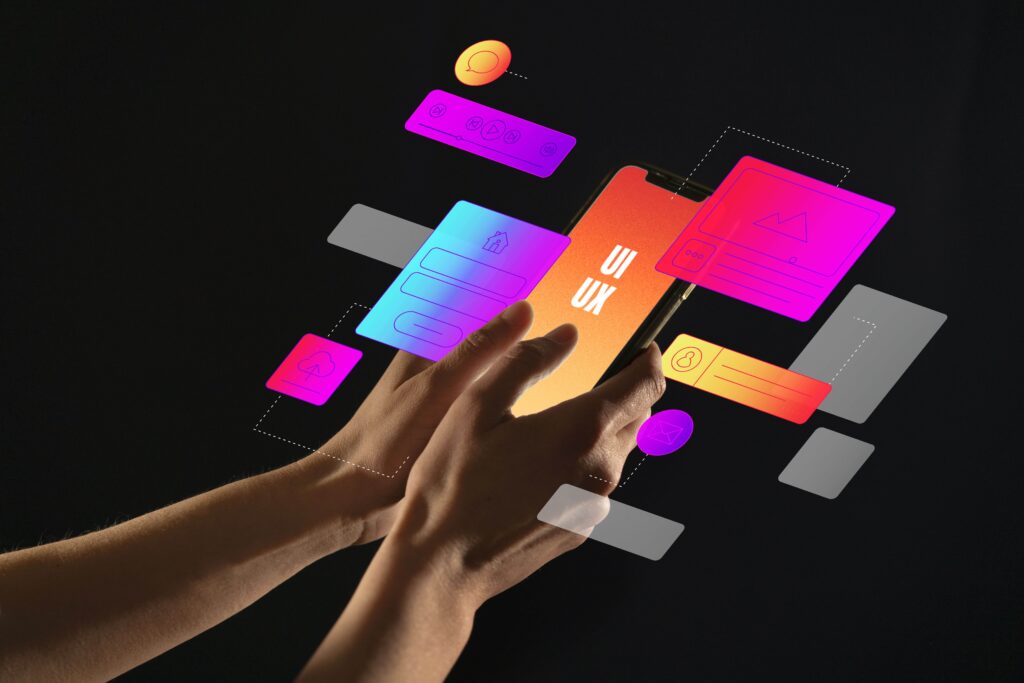
User Experience is all about how we perceive it, how we use it, and how we remember it.This “it” can be anything, here in our case it’s gonna be websites.
UX has evolved from being a noun to become a verb. We often hear our clients say “We need you to UX our website…How much you charge for UXing… Come up with a better UX…How long to UX it? UX this…UX that.”

In this blog, we will see what are things you should add/change on your website to make its user experience, a delight. In other words, How to UX your website.
Note: This blog post is written with non-e-commerce websites in mind, yet some ideas can also be applied for the same.
1. The On-boarding / landing page experience
By any means don’t have a dead screen on landing. By dead screen, we mean a landing page loaded with hefty content and nothing in particular, to emphasize on or to capture the attention of the audience. Once a website has made a negative first impression on us, chances are we will not enjoy our visit much or look forward to coming back. The chances are they had already visited dozens of website before landing on your page, so the point here is to give them a great first impression, all the while staying relevant to their expectation.
It may be as simple as having a bright background image, minimalist design with rich white space, background video/GIF, mouse over animations or any interactive elements.
Few ideas:
Making people spend a little more time on your landing section may have a huge impact on your Google search ranking. It’s a win-win. Read More.
Note:
Some people confuse being dead with being minimal in design. Minimalism in web design means simplifying the interface by removing unnecessary elements. Being minimal is great but being uninteresting is entirely a different thing. Let’s be clear, You can always be minimal & interesting at the same time.
2. Limit the content. Refine the words.
“Get rid of half the words on each page, then get rid of half of what’s left.” — Steve Krug
Having a load of contents will seriously affect the user experience. As people get bored quickly and skip the sections without even reading what’s written. Be super stingy about the number of words you put out there. Use precise words and sentences. Quality is important over quantity — Hit the bull’s eye. Don’t restrict yourselves to the mundane choice of words under the tag of professionalism. Use a happy or natural tone of speech or come-up with your own brand voice.
Use high-quality catchy visuals where ever you find it relevant & possible.
For most sections 70% Visual & 30% Content Rule holds good. Visual appeal plays a large part in establishing brand affinity with your website visitors.
As they say ‘A picture is worth a thousand words’ — and it’s especially relevant when it comes to communicating on a more emotional level. Use only high-quality images/illustrations. In 2018, it feels like custom artworks/illustrations are taking the center stage of visual content. Through pictures and other visual elements, you can convey feelings that aren’t possible to express by words or otherwise would have taken a paragraph.
In text-heavy sections (like testimonials/pricing details/forms etc.,), give even more importance to White Spaces & Text Hierarchy. It will give a clean & clutter-free look.
Notes:
White Space — White space or negative space is any type of blank space on the page. White spaces don’t necessarily mean to be white; the blank space may be filled with any colour as long as it is free of any elements like text or images.
Text Hierarchy — is a system for organizing type that establishes an order of importance within the data, allowing the reader to easily find what they are looking for and navigate the content.
Brand Voice — is the purposeful, consistent expression of a brand through words and prose styles, that engage and motivate. The personality of your brand is often determined by the words you use and the sentences you write.
3. Live chat. It’s a must-have.
The reasons are quite self-explanatory. The main reason being addressing the people’s concern then & there. It also has a high lead capture rate compared to the age-old contact us forms.
It also acts as a magic portal, u can expect all sort of wild things coming out of it like user feedback, lead generation, project enquiry, job opportunities, even out of the blue ones like you are being called as a chief guest to judge an app building hackathon in your region, which actually happened in our case.
People now are looking to make their chatting and support process over the internet, more interactive and intelligent. For this, leverage the advantage of having a chat bot which makes make your website more lively and interactive and also they return results faster comparatively.
There is good number of chat plugins out there — Fresh chat, Crisp, Landbot and more. Choose the one that suits your business.
4. Delicate things that matter — Micro Animations
Micro-animations are small, preferably functional animations that support the user by giving visual feedback and displaying changes more clearly. With micro-animations, it’s possible to explain a lot without using a word. These micro animations make interactions more pleasant & visually pleasing.
If there is anything that gonna differentiate your website from most of the websites out there, trust us, this is gonna be it. These tiny tiny detailing add up to give a profound influence on the user experience aspect of your website.
5. Finding the sweet spot between uniformity & variation
If you have a multi-page website, you would never want all your pages to be monotonous. Don’t have the same layout on every page and keep changing the content alone. This makes the experience a very very boring one. The same applies to different sections of the page.
Come-up with variations in layouts. There is a whole lot of layouts for web pages out there. Choose the one that best suits your content. But at the same time be cautious to not overdo it to the extent it feels like each page belongs to a different website, which will eventually leave the user confused & frustrated. It’s all about finding the sweet spot between uniformity & variation. You can retain the uniformity by maintaining — sustained color usage, font & button styling and other visual cues. Sticking with same menu bar/header and footer design will also make the multi-page websites more visually composed.
Related read:
Examples of content stream layout

6. And those annoying pop-ups — the workaround
Don’t use pop-up forms unless & until it is really really relevant and you are out of any other options. Pop-up forms are becoming highly outdated technique and anything inside the popup is considered as a bait nowadays. Most poorly designed popup forms, only serves the purpose of obstructing the user flow.
According to Hubspot, A good popup form should be designed with following aspects in mind:
1.Offer something relevant and valuable.
2.Think about the way people engage with your pages.
3.Use language that’s specific, actionable, and human.
4.Don’t ruin the mobile experience.
Read: https://blog.hubspot.com/marketing/pop-up-forms-analysis
But still, we don’t recommend using pop-up forms instead we insist you to blend the form as effectively as possible with your content and context (interaction and timing). By doing so, In most of the use cases, the necessity of pop-up can be eliminated — for example, Consider placement of blog subscription forms/check list/e-book download links in Medium.